A few years ago, at the Healthcare Estates Conference in Manchester, UK John Criddle from Evelina London Children’s Hospital and Martin Jones from Art in Site talked about how they designed the emergency dept. with the use of illustrative and digital arts to guide, reassure, and role model behaviors. Their talk was called: Taking the ‘OUCH’ out of Emergency.
Fantasy universe is a no go
They have had the experience that the typical ‘fantasy universe design’ in a lot of children’s wards was not very good because the kids got overwhelmed and scared when the reality didn’t fit this new world (this is NOT a nice place after all – the fantasy world in the entrance is nothing like this cruel reality of needles and pain!).
The contrast between the ‘happy but unreal’ designs to reality simply confuses the patient, they said.
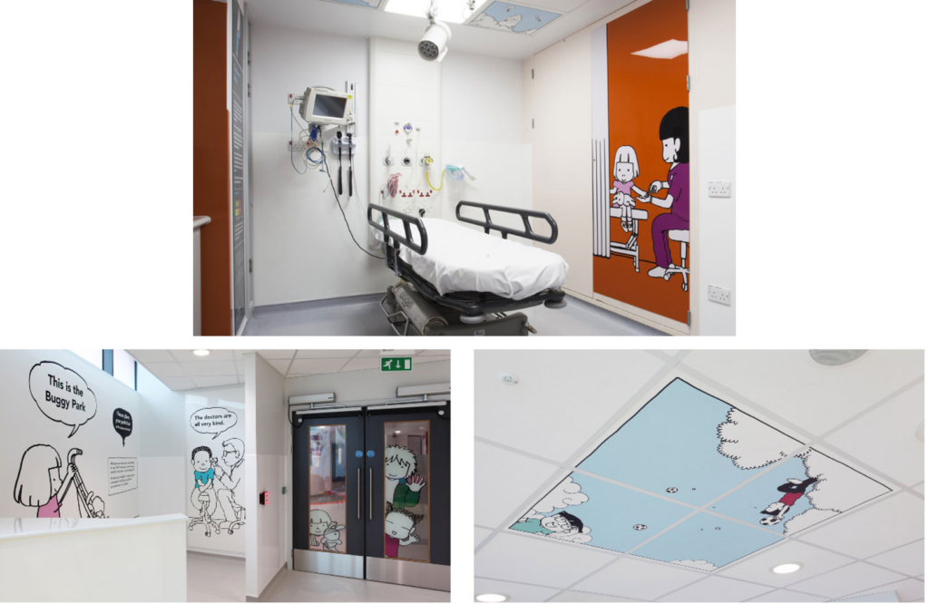
They decided to design an interactive universe – showing real situations and also modeling the behavior of the patients. Small films to show the kids real case stories – e.g. about a kid who bumped his head and what happened afterward. Introducing staff titles and that they are nice people who want to help when you feel bad. Showing a lot of stories based on the most common causes of visits to the emergency. The persona in the films is also integrated into the environment – popping out from doorways and getting treatment on the walls.
(Pictures from: http://www.artinsite.co.uk/projects/childrens-emergency-dept )
It was a very inspiring talk and it discussed that this must be the only way to design children’s hospitals in the future. But is this the only way to design a children’s universe in a hospital? Queen Silvia’s Children’s Hospital in Gothenburg, Sweden, has another way of welcoming the small patients
The Foundation for Queen Silvia’s Children’s Hospital
Some years ago, Jenny Jernberg from The Foundation for Queen Silvia Children’s Hospital (Insamlingsstiftelsen för Drottning Silvias barn- och ungdomssjukhus) made it possible for Acoustic Bulletin to visit the hospital – and she made it clear that acoustic design, in particular, is part of the cure.
The foundation has been fundraising money to improve life quality and well-being for children, young people, and families at Sweden’s largest children’s hospital since 2001, and the money is used to finance environments and experiences that can bring joy, comfort, inspiration, and extra powers all year around – like turning emergency rooms into an exciting jungle.
Turning emergency rooms into an exciting jungle??
Don’t create a world that doesn’t reflect reality, they said at the Healthcare Estate Conference – but this emergency department has another experience.
The entrance of the department is not a fantasy universe at all. It looks like a hospital (!) but huge jungle wallpaper creates warmth and gives the spectator something nice to look at.
Come on – follow me – let’s go to the Lemur room!
The treatment rooms
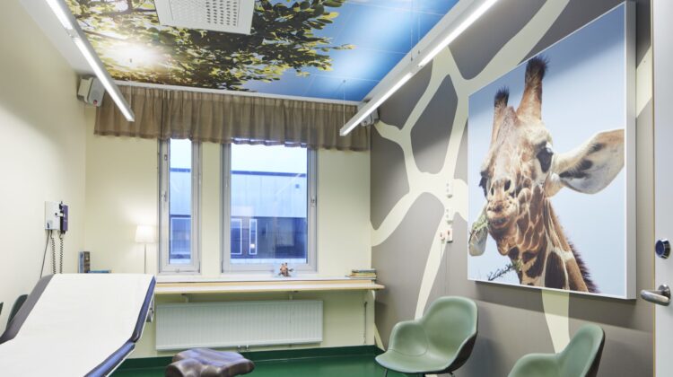
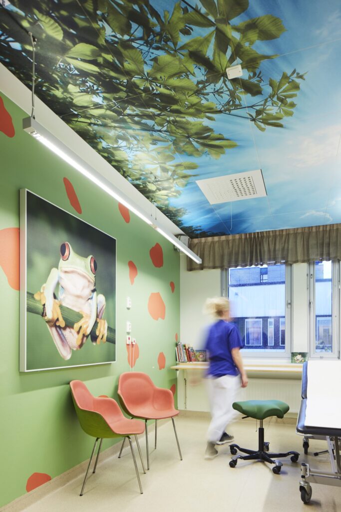
The treatment rooms are placed in the corridors that lead to the reception area and they all have a ‘theme animal’. Lemur, Koala, Zebra, etc. The rooms are ‘coded’ with a big picture of the animal (printed on acoustic wall absorbers) and furniture to match the story. Postcards with a presentation of the animal are also in the rooms.
The acoustic ceiling is printed in a way so you almost look up in the sky – with trees around you. On top of this, forest and animal sounds are played at a very low level in the rooms. Just enough to make you feel the jungle.
It is not possible to work much with biophilic design in a hospital because of the hygiene demands but there is no discussion about what the feeling of nature does to people and these rooms were nothing like a ‘fantasy universe’ but simply give the spectator (luckily we were only spectators – not patients) – or the patients a feeling of a nice, calm and interesting place.
A nurse, Petra, expresses that the kids are happy about the rooms!
‘And sometimes – if a kid, unfortunately, comes back – they ask for the same room, or they simply remember having been in the department before.
Jenny Jernberg from the foundation also has personal experience. Her son broke his arm and had to go there once – and for him, it was a good memory – and he still remembers the room he went to.
Distraction is important
Petra experiences that the possibility of distraction is important in her job and that talking about the animals and listening to the jungle calm the kids down (and also the parents!). She mentions that the ceiling was the most important part since a lot of the patients lay down! Instead of a white clinical surface, they could wander off in their mind to a nice place where the sky is blue and the animals play.
Petra explains:
The acoustics are of great importance. We feel it immediately when we enter a room that is not part of the jungle – and we even feel how much the sound affects us in one of the rooms where we had to remove the acoustic wall panel because of a refurbishment.
Clever hospital design?
Hospital design can be fantastic in a lot of ways – both like the UK example where the patients experience an interactive universe and in Sweden where the kids can dream off and learn about animals while listening, watching, and feeling. Distraction and information can both be right – and maybe the combination is optimum. Hospital design works best when dedicated skilled peopled are asked into the building process at an early stage and where the management doesn’t just accept ‘let’s do it like we did last time.
Author: Mai-Britt Beldam, Market Development Manager at Ecophon.


